Interior colors: how to combine colors? Proven color combinations
When choosing interior colors, it is worth considering which paints are appropriate. Each range of colors: warm, cold, dark, light – creates a specific effect. Let us choose one dominant color, which we will use on the walls, and its shades on the fabrics and accessories. Other colors may play the role of accents.
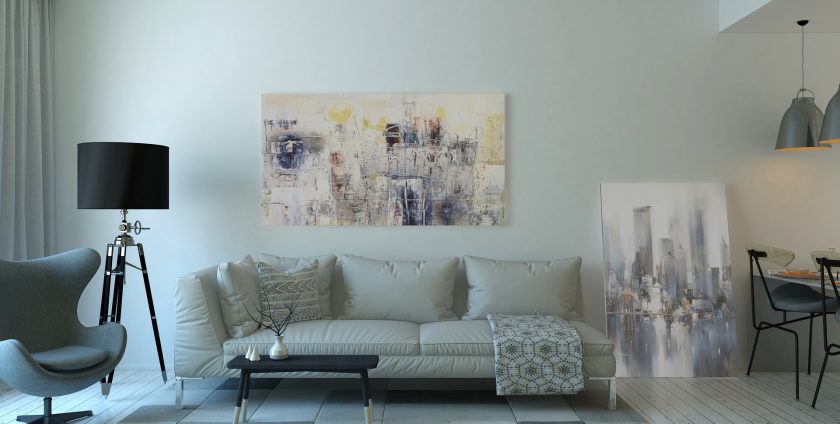
White, gray and earth colors – how to combine colors?
If you choose white, you can contrast it (eg with blue, red, wenge) or on the principle of harmony – whiten beige, brown, gray, pastels. White is always safe, all other colors match it. Gray, like white, is neutral. This is a good background for other colors – from white through reds, greens, blues, browns to black. Colors of the earth – a whole range of beige, brown, sand and cream colors. They are calm, conducive to relaxation and it is difficult to dissonance when they are combined.
Interior colors: optical tricks
Warm colors of the walls optically reduce the interior, the spacious living room will gain cosiness thanks to them. In the small, however, they are a bit risky. Cold colors on the contrary – they give the impression of a larger interior. Dark depending on the color tone – mainly whether they are cool or warm – and the type, amount and power of light in the interior can strengthen them. When the room is poorly lit, and the shades cool, an impression of mysterious depth will arise. This is how we perceive the colors of the walls in the shade of graphite, bottled green, dark bitter chocolate, burgundy, warm deep purples. Bright interior colors are always an option to enlarge the interior and add lightness.
How to combine the color of interiors: harmonizing colors
In order to achieve a harmonious final effect, when choosing wall colors, it is best to use the practical tool, which is the color wheel. It is a graphical model for explaining the principles of mixing and creating colors. With its help, you can choose colors that harmonize with each other (harmonizing colors), and create a successful combination of colors according to the harmony of colors. A valuable tip to start with: some of the most used colors in interior design – black, white and gray – do not appear in the color wheel (just like in the rainbow). That’s why they can be a complement to any other color, they also perfectly combine with each other.
With the help of the color wheel, you can create several types of harmony. One of them is complementary harmony, consisting in the use of complementary colors on the opposite side of the circle. In combination, these colors bring out their values, seem more intense. Such connections are perfect when we want a clear effect. In turn the most popular monochromatic harmony, which is a hit in the case where we want to achieve a subtle effect, is based on the use of different shades of one shade at the same temperature. An example of this type of harmony is the use of three shades of green. It works in any interior.
You will achieve a triangular harmonica by combining three colors located on the tops of an equilateral triangle inscribed in a circle of colors, for example combining turquoise with orange and purple. Such a combination soothes contrasts and enriches colors, adding depth to them. If you want to put on analogy harmony, put together three colors located next to each other in a circle of colors. Such harmony will work if you care about a clear color accent in a modern interior.

